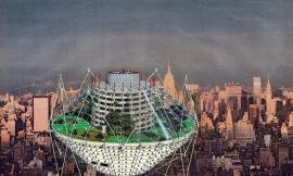
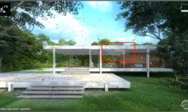
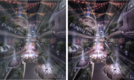
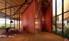
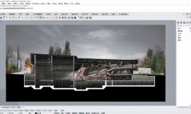
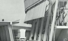
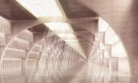
来自专筑编辑刘庆新的报道。起初在我还是本科生时,设计这个项目的时候,我花了很多时间在剖面设计上。它是一张很重要的图,因此我想把以前博文里描述的抽象图暂且搁置,将精力移到能清楚理解的实际建筑物中来。我不想让这种变化显得太突然,因此我保留了在其他图里使用过的网格纹理。下是这张图的分步讲解,它展示了如何一步步得到这个效果。
When I originally designed this project back in undergrad, I put a lot of time into the design of the section. It’s an important illustration and I therefore wanted to move away from the abstract illustrations described in the previous posts and move towards a clearer reading of the actual architecture. I didn’t want the move to be too extreme so I kept remnants of the same gridded texture used in the other illustrations. Below I break down the image to show the steps taken to get to this point.
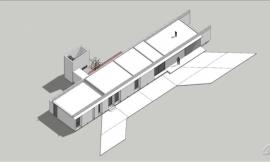
1. 导出线条
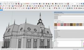
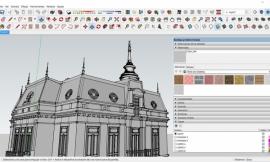
我从 SketchUp 中导出来一些线条。我通常会导出许多线供选择使用,尽管我不确定我是否会使用它们。这个过程只需要几秒钟,导出的这些线可以让我在 Photoshop 中分别实验。在这种情况下,我先到了一张面样式设置为“隐藏线”的图,然后导了一张“隐藏线+X 光透视”样式的图,最后导了一张只开启辅助线的图。
1. Export Line Work
I exported several line work images from Sketchup. I typically export many line work options whether I know I am going to use them or not. It only takes seconds and gives me more options to experiment with once in Photoshop. In this case, I exported images with the face style set to “Hidden Line”, then with “Hidden Line and X-ray”, and an image with only the guides turned on.
2. 素模渲染
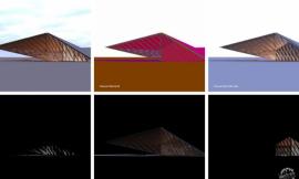
接下来我很快地对 SketchUp 模型进行了一个素模渲染。下面这张图我使用了 Kerkythea,但是实际上任何一个渲染器都可以做到,只要渲然的图可以和 SketchUp 导出的线一致即可。我微调了渲染图的色阶并降低了饱和度,获得了下面这张图。点击CLAY MODEL RENDERINGS和ADJUSTING THE LEVELS观看教程。我还想说的是我使用Zorro Plugin来切割模型,因为这样我才能渲染剖面。
2. Clay Rendering
Next I did a quick clay model rendering of the Sketchup model. I used Kerkythea to render the image below but really any rendering program will suffice just as long as the rendered image aligns with the Sketchup exported line work. I also tweaked the levels and desaturated the rendering to get the image below. See this tutorial on CLAY MODEL RENDERINGS and also this post on ADJUSTING THE LEVELS . I should also say that I used the Zorro Plugin to cut the model which allowed me to render the section.
3. 填充剖切面
我想要剖切面突显出来,所以我把它涂红了。并没有什么奇妙的。我用多边形套索工具来选出剖切面,然后使用油漆桶工具将选区填充为红色。这个过程在QUICK SECTIONS教程中描述得更详细。
3. Poche the Cut
I wanted the cut geometry to be graphically strong, so I shaded it red. Nothing fancy here. I used the polygonal tool to select the cut areas and used the paint bucket tool to fill the selections with red color. This process is described in more detail in the QUICK SECTIONS tutorial.
4. 颜色调和
此刻的图片看上去太僵硬了,它需要更多的颜色。我希望坡道和三个结构元素突显在剖面图中。解决这个问题的简单办法就是叠加一些暖色调图层。在这张图中,我没有考虑材质。它仍然是非常图解的,我打算在后面的透视图中提供这些信息。
4. Tone
The image at this point is too stark and needs more color. I want the ramps and three structural elements to stand out in the section. An easy way to solve this is to add some warm tone overlays. With this illustration, I’m not concerned with materials. It’s still diagramatic and I plan to have the perspective illustrations later on to provide that information.
5. 内景深度
这个设计中包含许多坡道,还有半透明材质图层,但是它们在图中并没有体现出来。为了修正这个问题,我在坡道上增加了一种低透明度的浅蓝色来代表半透明材质。接着我又把这个图层复制了两次,这样在坡道之间就体现出更好的深度感和层次感。
5. Interior Depth
The design contains many ramps as well as layers of translucent materials but this is lost in the illustration. To fix this, a light blue paint with low opacity representing the translucent material was added above the ramps. I then copied this layer two more times to give a better perception of depth and layering between the ramps.
6. 纹理
在之前的博文中,在图的顶层我曾叠加过一张纹理非常强的网格样式,来表达转移原始网格的构思。这个理念延续到了这里的剖面,但是我想要纹理的色调降低。我用了一张有不同颜色方块的纹理图片,拉伸它以获得的更多的方向感,然后调节其尺寸,让它和建筑的柱间距保持一致。接下来我复制了纹理,然后旋转它来和第二级网格一致。两个图层的透明度都设置为 20%。
6. Texture
In the previous posts, I have been overlaying a graphically strong grid pattern over the illustrations to convey the idea of shifting organizing grids. The concept still follows through to the section, however, I want the texture to be toned down. I took a texture of different colored squares, stretched it to give more directionality, and then scaled it to work with the column spacing of the architecture. I next duplicated the texture and rotated to match the second grid system. Both layers were set to 20% opacity.
7. 人物
在剖面上加一些人的做法很流行,这样有一种尺度感。把人物图片变成剪影的快捷方法是打开“图像>调整>色相/饱和度”。然后把亮度滑块移动到最左边。
7. People
The section was populated with people to give a sense of scale. A quick way to change the people into silhouettes is to go to “Image>Adjustments>Hue / Saturation”. Then move the “Lightness” slider all the way to the left.
8. 对比
目前我对这张图感到很满意。但是,在我看来这张图还是有点平,缺少层次感。在图中使用较强对比能吸引住人们的目光。为了达到这个目的,我把最终的图像复制了一层并减小饱和度,然后把混合模式改为“叠加”,将其移动到原始图层最上面。这样可以加深阴影,提高加亮区。这和调整色阶或曲线类似,但是会产生一点不同的效果。在IMAGE SOFTENING教程里可以看到类似的工作流程。
8. Contrast
At this point, I am happy with the illustration. But, the image still reads a little flat for my taste and is lacking hierarchy. More contrast helps to move the eye around the image. To do this, I duplicated the final image layer, desaturated it, and set the layer blend mode to “Overlay” on top of the original layer. This deepens the shadows and brightens the highlights. It’s similar to adjusting the levels or curves, but gives a slightly different look. A similar workflow can be seen in the IMAGE SOFTENING tutorial.
下面是最终图。
Below, the final image
出处:本文译自visualizingarchitecture.com/,转载请注明出处。
|
|
专于设计,筑就未来
无论您身在何方;无论您作品规模大小;无论您是否已在设计等相关领域小有名气;无论您是否已成功求学、步入职业设计师队伍;只要你有想法、有创意、有能力,专筑网都愿为您提供一个展示自己的舞台
投稿邮箱:submit@iarch.cn 如何向专筑投稿?