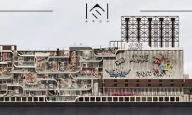
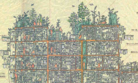
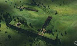
I have been developing several illustrations for the Porter Sq project the past couple of months and have finally finished one of the section diagrams. I decided to go a little old school with this one and keeping things monotone. With this style of illustration I am layering in several types of textures to break up the 3d perfection and add a little grain and abstraction. The illustrations that I am creating these days are at a much higher resolution than the work I created several years back and thus I approach texturing a little differently. The higher resolution means that viewers can view the image at different vantage points and the image needs to be able to read well at both a distance and up close. This means the textures are applied at both a macro and a micro level. There are times when I am adding textures close up at specific moments, and there are times when I am applying textures across the entire image. I even applied two layers of noise that read different depending on how close you are to the image. Below is a breakdown of some of these details.
1、基本渲染图像
1. Base Rendering Cleanup
V-Ray基本渲染白模
V-Ray Base Rendering with Material Override On
给剖面添加白色线条和人物
Base Rendering with the Section Cut Poché and Entourage
用SU模型渲染一个基础的白模,然后在PS中进行简单的处理,给剖切面添加白色的线条和相应尺度的人物。
A simple V-Ray clay rendering was generated from the Sketchup model. I then cleaned up that rendering in Photoshop by adding a white poché to the section cut as well as people for scale
Adding “Smudges” is an easy way to break up the perfect gradients of the base rendering. Here, I am just painting in some black paint using a soft brush at a very low opacity. I am focusing the the smudges at corners and where shadows are collecting. You will also notice that there are moments where I masked the smudges for sharp edges to create an ambient occlusion effect to play up certain geometry planes. Finally, I added some tone to the sky to better define the horizon and actual section cut.
I wanted to further break up the perfect gradients of the clay model rendering, so I added textures to specific moments around the image. These textures added a hint more detail when zoomed in close to the image.
A texture was applied across the entire image. Since the textures in the last step were meant for a closeup view, the texture used here is meant to read from a distance and won’t be that perceivable up close. The effect is subtle, but helps further breakup the smooth gradients in the sky and over the entire image in general.
I’m in a “Noise” phase at the moment where I seem to be adding noise to every image I create. I like how it breaks up the super sharp edges of a rendering and adds a bit of abstraction. In the case of this image, I applied two layers of noise. The first layer had a larger scale so that it would read at a macro scale. The second layer of noise had a much finer grain to it and was meant to read better when zoomed in close to the image. Both layers had a lowered opacity so that they somewhat blended together.
Finally, I added a hint of color to the image and darkened everything slightly. This section cut illustration with the desaturated tones and layers of texture is one of my favorite style of images to work on. From a technical standpoint they are easy to create. Even though it has an old school feel to it, the image still works well as a diagram and clearly conveys some complex information. I am planning to follow this up with an aerial axon illustration soon.