Past Presentation Boards: Fail
我在这里很少提到展板,但现在看起来这是很好的过渡。我一直在回顾我的旧展板,从而发现有很多继续在犯的很愚蠢的错误。
下面的展示作品是在 2006 年我读大三的时候创建的。这个设计是一个城市规划的项目,我们展示了我们在俄亥俄州托莱多市中心的控规的研究。那时我才用Ps大约一年时间,之前都是用手绘,这可能是我用 Ps来完成展板的第三个项目。所以,我会用这些展板来讲述一下,哪些是错误的。
Presentation boards are something I haven’t really talked about on this site and they seem like a good thing to transition into. I waslooking through some of my old boards and couldn’t stop noticing really stupid mistakes that I kept making.
The below presentation was created in 2006, my junior year in undergrad. The design was an urban planning project and we were presenting our massing studies of an area in downtown Toledo, OH. At the time, I had only been using Photoshop for about a year, and this was probably the 3rd project that I had used Photoshop to create my boards with instead of drawing them by hand. With that said, I will use these boards to begin explaining what not to do.
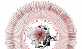
BOARD 1/展板1
第一个让我难以启齿的就是展板上几乎没有任何标签和说明。由于某些原因,我觉得没有必要写很多东西。但这是至关重要的,因为你不会总是站在展板旁边去解释你的设计。所以一个简短的解释可以快速介绍给参观者你在想什么。这也可以让裁判在假装听你讲解的时候,看他们自己感兴趣的内容。我通常喜欢写上3到4句话来介绍展板,总结设计的整体理念,并且给参观者一个开始看展板的地方。然而这个展板,什么也没有。
当大地分析覆盖了大部分的内容,它是一个重要的分析图,但它不应该是展板的焦点。大地分析上叠加一个航拍地图,或与多个分析图合并,展示我试图表现的分析。在这种情况下,看来我是比较担心展板的组成,而忽略了我要表达的信息。
The first thing that really grinds my gears is that there are hardly any labels or explanations. For some reason, I felt it wasn’t necessary to write much. This is crucial because you won’t always be standing next to your boards to defend the design. Having short explanations give viewers a quick introduction into what you were thinking. It also allows the jurors to understand the parts of the project they are interested in while they are pretending to listen to you talk. I typically like to have a 3 to 4 sentence paragraph on the introduction board summarizing the overall concept and giving viewers a place to start. This board, however, has nothing.
While the large figure ground covering most of the sheet is an important diagram, it should not be the focus of the board. It might have helped to overlay an aerial image or combine multiple diagrams with the figure ground to amp up the message I was trying to get across. In this case, it seems I was more concerned about the composition of the board rather than the information I was trying to convey.
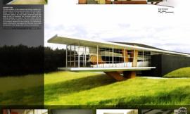
Board 2/展板2
第二张展板也不好。再次提出的是,展板还是没有任何的说明。而最大的错误就是这张展板在右边灰色遮罩部分的空间浪费。在遮罩里的图片没有说清楚任何事。其实这里应该是表现分析图或者文字说明最理想的地方。
在展板上左上角的图片应该移去。它掩盖住了立面图的一部分。而且它在第一张展板的模型照片里以这个角度出现过,并且,将会在下一张展板里再次出现。
立面图太过扁平化。我记着当时花费了很多的时间来设计建筑的剖面图,但是却没有任何图纸展示了剖面图。剖面图将会是一个更好理解建筑的形式,而立面图对于空间比例的体现会显得混乱,而且难以理解。
The second board isn’t much better. Again, not much information explaining the images. My biggest beef with this board is the waste of space in the gray box on the right side. The images in the box graphically aren’t saying anything. This would be the perfect place for more diagrams or text explanations.
The image at the top left of the board should be removed. It is covering up part of the elevations and is representing a view that already appeared on the first board with the physical models, and will appear again in the next board.
The elevations read extremely flat. I remember spending a lot of time designing the project sectionally, yet I don’t have any drawings showing a section slice through the site. The sections would have provided a much better understanding of the forms and scale of the spaces compared to the elevations that just come off as confusing and hard to read.
Board 3/展板3
我还记得我刚完成这个夜景渲染图的时候非常兴奋。这是我第一次尝试这个技术,而且图片的效果高于我的预期(查看怎样创建这类效果图的教程)。但是最大问题就是,所有的渲染图都是鸟瞰图。没有站在人的视点,来描述真实步行穿过建筑的体验和感受。那时候的想法是可以通过这些类型的视野来更好地展现建筑。但是,使用这种方法,我本质上是展现了一个雕塑,而不是一个可以居住的建筑。我也没有在建筑内外增加人物,一切都显得毫无生机。而增加人物后,这些渲染图气氛会大不一样,显得生气勃勃。
在这三张展板里重复出现同一个视野是糟糕的。我选择的模型的照片与渲染图所呈现的观点几乎完全相同。虽然现在看起来错误很明显,但是在当时,我并没有三思而后行。
当你回头看看过去的展板,很容易发现它们的错误。这也让我意识到,当下一次时间紧迫时,我可以吸取前面的教训,做出更加有高效的决定。这仅仅是众多项目中的一个,所以我期待在后面的展板里看到更多的批评指教。
I remember getting really excited with how these night illustrations turned out. This was the first time I tried this technique, and it had come together better than I was expecting (See the tutorial on how to create these illustrations HERE). The big problem though is that all the rendered images are at bird’s eye view. Nothing is at eye level describing the experience of actually walking through the site. My thinking at the time was that I thought I could explain the building better with these types of views. But with this approach, I am essentially explaining the design as a sculpture and not as an inhabitable structure. I also show no people in or around the site, making everything feel lifeless. Adding people would have made a big difference in the atmosphere of these illustrations.
The repetition of views in these three boards are horrible. The pics I chose of the physical model are almost identical with the rendered views. While it seems obvious now, at the time, I didn’t think twice about it.
While it is easy to look back at past presentations and pick them apart, it has also made me aware of the decisions I tend to make when I’m under a time crunch and has allowed me to work more efficiently the next time around. This is just one project of many so expect to see more critiques later on.
出处:本文译自visualizingarchitecture.com/,转载请注明出处。
|
|
专于设计,筑就未来
无论您身在何方;无论您作品规模大小;无论您是否已在设计等相关领域小有名气;无论您是否已成功求学、步入职业设计师队伍;只要你有想法、有创意、有能力,专筑网都愿为您提供一个展示自己的舞台
投稿邮箱:submit@iarch.cn 如何向专筑投稿?