Past Presentation Boards: Part 2
我上一篇博文讨论了一些建筑展板,讨论更多的是失败的排版。本周我想讨论一些标准水平的展板,但是它们需要一些轻微的调整。我也注意到一些评论,要我再说一些讲板,根据我的评论来编辑它们。我觉得这个主意不错,因此我尝试在这篇博文里做一下。
My last post discussed some architectural presentation boards that were, for the most part, poorly organized. I wanted to go into this week’s post discussing some presentation boards that were almost up to par, but just needed some tweaking. I also noticed some comments asking me to revisit the boards, editing them based on my critiques which I thought was a good idea and therefore tried to do in this post.
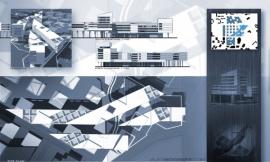
这组展板是我在大学本科最后一年的作品,是为克兰布鲁克学院在 2007 年举办的竞赛中而设计的。这个竞赛要求四张 20″X20″ 的展板。这个项目的大量工作,是把许多的信息塞入四张展板,而且动手操作的时候比我想像的还要困难。此外,我一直觉得将图片排列成正方形的格式,对于我来说是一个挑战。这四个板的设计使得在单独阅读时很方便,而且当它们并排放置时,还与另一个产生联系。这是通过建立一个简单的网格来完成,并且创建了一个展板和展板之间的关系,例如使用相同大小的窗口或者重叠的背景元素。
To begin, this group of presentation boards was created in my final year of undergraduate school for a competition held by the Cranbrook Academy in 2007. The competition asked for four 20”x20” boards. For the amount of work that went into this project, cramming so much information into four boards turned out to be more difficult than I anticipated. On top of that, I have always found it challenging to organize graphics on a square format. The four boards were designed to read well by themselves, but also relate to one another when placed side-by-side. This was done by setting up a simple grid and creating relationships from board to board such as using the same size windows or overlapping background elements.
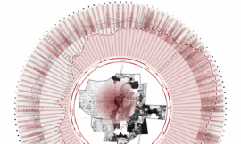
Above: The original board/原始的展板
建筑展板 1-介绍板:
我再次访问的第一张展板是排版左上角的大的总平面图。现在再看,里面的一些问题会立马跳出来。
1. 首先,左边的分析图好像在这里不合适,并不属于这张展板。它们就像是被困在那里,因为我不知道把它们放在哪里。也许可以有一些技巧可以提升这张展板。但是,再找到办法之前,我觉得它们就是不属于这张展板。
2. 主背景图片的色调太冷了。我不惜任何代价就是为了避免色差的这个阶段。这一点你可以在我的本科作品集中看到,我使用了整版的黑色和白色。祛色的总平面图就存在一个最大的问题——缺乏生命力和活力。而在当时,我把它看作是艺术,在现实中,它并没有积极的突出项目的设计。
3. 文字也迷失在背景中。我记着当时这样做是害怕文字会喧宾夺主。所以我把文字变淡,并把它扔到了总平面最乱的地方,这样文字变得非常难以阅读,而且还分散了整体构图的注意力。
ARCHITECTURAL PRESENTATION BOARD 1- INTRO BOARD
The first board that I revisited was the top left layout with the large illustrated site plan. There are a couple of things that jump out at me right away.
1. First, the diagrams on the left feel like they are out of place and don’t belong on the page. They seem like they were stuck there because I didn’t know where else to put them. There are probably a few tricks I could do to set them better into the page, however, I feel that they just don’t belong.
2. The main background image is too cold. I was in a phase back in the day where I avoided color at all costs. You can see this in my undergraduate portfolio where the whole thing is black and white. The problem with the mostly desaturated site plan is that it comes off as lifeless. While at the time, I saw it as being artistic, in reality, it’s not projecting the design in a positive light.
3. The text gets lost in the background. I remember doing this because I was afraid of the text distracting too much from the large site plan image. But, because I faded it out and threw it on top of a busy part of the site plan, the text becomes very difficult to read and almost becomes more distracting to the overall composition.
Above: The new board/新的展板
我对于以上问题的解决办法就是使事情变得简单。典型的介绍板,我想让它们简单,但是功能强大。我觉得总平面图,经过调整的话,可以变得更加强大。我稍微的让它有点颜色,并且叠加了一个绿色的图层。这些步骤只花费了 10 分钟,但是得到了与众不同的效果。我也把这张展板上的分析图移到了别的展板上,取而代之的是排版上文字。我变暗了黑色透明的遮罩来帮助把文字从背景分离,这使得两者没有冲突。我还摆了一个扫描的手绘图在文字下面,以此来结束这段文字。
What I did to solve the issues mentioned above was to simplify things. Typically with the intro boards, I like them to be simple but powerful. The site plan I felt, could be a powerful image if tweaked. I pulled back the destaturation a little, and added a green overlay. This took all but 10 minutes but really made a big difference. I also moved the diagrams off of this page and onto a different board. This cleared up some space to move the text around. I darkened the black transparent box to help separate the text from the background, so that the two didn’t compete. I also placed a scanned sketch just below the text as a way to end the paragraph.
Above: The original board/原始的展板
建筑展板 2-分析图和平面
我认为第二张原始的展板有一个得体的排版。展板上有大量的信息,但是还是缺乏一些可读性。
1. 平面图难以理解。这个排版是一个棘手的问题,因为平面图自身就是一个奇怪的形状。所以,我需要在尽量不缩小尺寸的情况下将其调整到最适合所在页面。而且里面也有很多的线条使得很难理解,例如什么是里面,什么是外面,什么是坡道,什么是走廊等。
2. 连接着平面图,所以底部的剖面图是几乎不可能一眼就能看出来。理解剖面图是理解这个项目设计的关键,所以,剖面图必须要改进设计。
3. 左边的手绘图不属于这个展板,但是它对于整合设计过程很重要,但要找到一个地方来摆放它是一个挑战。
ARCHITECTURAL PRESENTATION BOARD 2- DIAGRAMS & PLANS
I think this second original board has a decent layout. There is a lot of information on this layout, but much of it is difficult to read.
1. The floor plans are hard to understand. This was a tricky part of the layout because the floor plans themselves are an odd shape. Therefore, I had to fit them on the page the best I could without making them too small. There is also so much line work that it is hard to decipher what is inside, what is outside, what are ramps, what are corridors, etc.
2. Along with the floor plans, the section at the bottom is next to impossible to understand at a quick glance. Understanding the section is key to understanding the design of this project, therefore, the section must read better than it currently does.
3. The sketches on the left don’t belong on this page. It’s always important to integrate process work, but finding a place to include it can be challenging.
Above: The new board/新的展板
首先需要注意的是第一展板的分析图和第二张展板的手绘图互换了。这样讲述项目会更有条理。接下来,我稍微填充了平面图。这个小小的举动,却产生了惊人的效果,使得人们可以快速的理解平面图。现在,一些建筑元素例如建筑的内部和外部,平面上的开放空间,垂直交通,一眼就能看出来。最后,我重新审视了剖面图,并且运用技巧增加线条的深度和清晰度。我很喜欢简单的线条风格,加入少许的阴影效果会更好。
下周我会重审最近的两张展板,并且讨论怎样让第三张杂乱的排版看起来整齐。记得回访我!
The first thing you may notice is that the diagrams from the first board were switched with the sketches on the second board. This tells a more organized story of the project. Next, I faintly shaded the floor plans. As subtle of a move as this is, it makes a big difference on how fast one can read and understand the floor plans. Now, items such as inside vs. outside, openings in the floor, vertical circulation, etc. can be understood at a glance. Finally, I revisited the sections, and applied a technique popular on this site to add depth and clarity to the line work. While I like the simplicity of just the line work, adding a little shading goes a long way.
Be sure to check back next week. I will revisit the last two boards and discuss how to unclutter a overly busy layout as seen in the third rendering board.
出处:本文译自visualizingarchitecture.com/,转载请注明出处。
|
|