由专筑网刘庆新编译
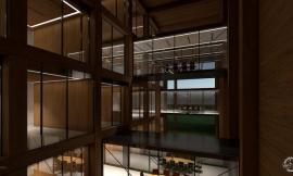
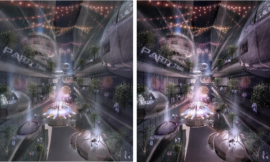
这篇旧博文收到了大家的许多反馈,要求得到一个较为详细的渲染图分步教程。这张室内渲染图尤其得到了大量关注,所以我准备从这张图入手。因为具体工作流程中的一些步骤已经在之前的博文里谈到过了,为了防止重复,我会给之前谈到过的部分添加相应链接。
This past post received a lot of feedback from you asking for a more detailed breakdown of the illustrations. The interior illustration in particular got a lot of attention so I am going to start with that one. Since several different parts of the workflow have already been talked about in the past, I will be adding links to the corresponding sections to avoid too much duplicate information on this site.
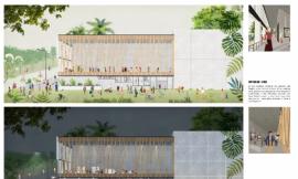
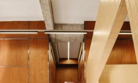
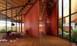
1. 对于这张室内渲染,我以确定打光的位置和打光的方式作为开始步骤。我设计了一些条状的吊灯来给周围环境提供大部分的灯光。然后我找到一些特定的区域使用灯光来凸显形式,关于这个特定区域,比如说在楼梯围墙周围,以及使用灯光照亮大面积的侧墙。
1. For this interior shot, I started the process by identifying where and how I wanted to light the space. I designed some linear pendant fixtures to provide most of the ambient light. Then I looked to some specific areas to use the light to highlight the form such as around the stair enclosure and washing the large side walls.
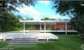
View selected in the Sketchup Model/在 SketchUp 模型里选择的视角
Blue highlights show proposed locations of artificial light/蓝色高亮处展示人工光源设置的位置
2. 灯光位置一旦确定,我开始给这些位置应用独特的材质,这样在 Kerkythea 里我就可以区分这种材质并将其设置为自发光。我选择了一种颜色,并确认没有在其它模型中使用过,在这个模型里我使用的是红色。我还把这些材料重命名为灯光 1,2,3等。这样导入 Kerkythea 后更容易识别。
2. Once the locations were determined, I began applying a unique material to these locations so that I can tell this material to emit light later on in Kerkythea. I use a color that I know is not being used anywhere else in the model, in this case red. I also renamed the material such as Light 1, 2, 3, etc. so that it would be easier to identify when imported into Kerkythea.
3. 然后我把模型导进Kerkythea,并把材质设置为自发光。通过在左侧找到该材质,右击,然后选择“编辑材质”。在材质编辑对话框中,我首先将漫反射颜色改为白色。接着我在自“发光栏”将发光颜色改为白色。强度、效率、单位的设定取决于你灯的大小和空间大小,但是你可以先尝试一下我演示的办法,然后再调整强度的参数来获得更强或者更弱的灯光。布置好光线后,我进行了快速渲染,该渲染图要在 Photoshop 中作为底图。关于步骤更详细的解释可以在这里找到。
3. The model is then imported into Kerkythea where I can begin telling the material to emit light. This is done by finding the material on the left, right clicking, and choosing “Edit Material”. In the material editor dialogue box, I first change the diffuse color to white. I next tell it to emit light by going to the “Self Luminance” section and giving it a “Radiance” color of white. The “Power, Efficiency, and Unit” settings will change based on how big your light and space are, but you can start with what I am showing and tweak the “Power” setting for more or less light. With the lights in place, I did a quick rendering which will be used as a base image in Photoshop. A more in depth explanation on this process can be found HERE.
Above, a rendering from Kerkythea with artificial lights/上图为带有人工光源的 Kerkythea 渲染图
4. 得到一张底图后,我准备去 Photoshop里操作。我决定在渲染图上叠加白色线条,使其多一些纹理。我在 Photoshop 里打开从 SketchUp 导出的线稿,将图层移动到底图的上层。在“图像——调整——反相”操作里将线稿颜色颠倒。然后将混合模式改为“滤色”。
4. Now that I have a base rendering, I am ready to go into Photoshop. I decided to overlay white line work onto the rendering to give the illustration a little more texture. Open the exported line work from Sketchup in Photoshop and move the layer above the base rendering layer. Go to “Image>Adjustments>Invert” to invert the line work colors. Then set the Blend Mode of the layer (found in the layers palette) to “Screen”.
Exported line work from Sketchup/从 SketchUp 中导出的线稿
Line work inverted to create white lines/反相后线条变为白色的线稿
Rendering with white line work layer set to “Screen”/将白色线稿图层设置为“滤色”后的渲染图
5. 意识到我不会叠加任何导出的 SU 图像。我想调整视角,这样垂直线就非常直、非常垂。选择所有图层,点击“编辑-变形-透视”。这里有一篇以前的博文,里面对调整视角讲得更深入。
5. Knowing that I won’t be overlaying anymore exported SU images, I want to adjust the perspective so that the verticals are perfectly straight up and down. Select all of the layers, then go to “Edit> Transform> Perspective”. There was a post on this subject a while back going into more depth which can be found HERE.
6. 下一步是我正在试验的一些新东西。我想要给渲染图添加一些暖色调和细节,这种情况下,我通常会调整色阶以及添加颜色图层。但是,这次我用了Photoshop 的外挂滤镜 Topaz Labs。它主要是一个图片编辑软件,但是用在我的建筑渲染图上非常好用。给图片添加更多的细节以及颜色时,它显得更灵活。我在这张图里使用了外挂滤镜来给木材和混凝土材料添加细节。
6. This next step is something new that I have been experimenting with. I want to add some warmth and detail to the illustration in which case I would typically adjust the levels and add a color overlay. However, I have been playing around with a Photoshop plug-in by Topaz Labs. It is primarily a photo editing software but it has been working great for my architectural illustrations. It offers a little more flexibility in terms of pulling out more detail and color in the images. I used the plug-in here to up the detail of the wood and concrete materials.
7. 现在我开始处理渲染图的细节部分。我首先要强调的地方是,我给外部添加了一个背景,在天花板上安装了一些发光物质。
7. At this point, I am ready to get into the details of the illustration. The first couple of areas that I want to address are adding a background to the outside and fixing some lighting issues in the ceiling.
8. 人物对尺度问题的反应总是重要的,所以我在渲染图中扔进来一些人物。查看这个视频教程来获得这个项目更多的信息。
8. People are always important for scale so I threw a few of them into the illustration. Reflections and shadows are key to getting your people to look like they belong in the illustration. Check out THIS VIDEO TUTORIAL for more on this subject.
9. 我想要强调这个空间的尺度,和从室外射入的大量光线情景。我可以使用高光和雾来解决这两个问题。使用画笔工具,选择白色,并使用一个很低的透明度。我在想象的有许多光线照进来的地方添加了一点薄雾。然后我以同样的办法,创造了景深,在离视点较远的空间处创造出“雾”的感觉。虽然这只是一个很小的举动,但是却帮助强调了内部空间,同时也让渲染图更接近我所想要的效果。这篇博文更详细地说明了如何添加雾景。
9. I wanted to play up the scale of the space and also the fact that so much light would be washing in from the outside. I can solve both these problems by using glare and fog. Using the brush tool and white paint with a really low opacity, I added a slight haze where I imagined a lot of daylight would be coming into the space. I also used this same method to create depth by painting in “fog” as the space projects further back into the distance. It’s a subtle move but helps to emphasize the areas of the interior that I want emphasized and gets the illustration closer to the atmosphere that I am looking for. THIS POSTexplains in more detail how to add fog.
10. 接下来更多的颜色被叠加。整张图依然存在着许多不同的色调。把它们整合到一起的一个方法是叠加颜色。我几乎每张渲染图都会使用这个办法,当然也包括这张图。因为这个项目的所有渲染图都有一点暖色调,所以我打算叠加橘色上去。这里有更多关于颜色叠加的信息。
10. More color overlays. There are still many different color tones going on throughout the illustration. One way to unify this is by adding color overlays. I do this on almost every illustration and this one is no exception. All of the illustrations for this project are going to have a slightly warmer palette so I am going to add an orange color overlay. Check out THIS POST for more on color overlays.
11. 现在图片看上去很不错了,最后一步可以没必要做。但是我再一次使用了 Topaz 滤镜中的 “Adjust”来微调颜色并给渲染图添加细节。
11. The image is looking good at this point and this last step probably isn’t always necessary. However, I used the Topaz Plugin “Adjust” one more time to tweak the colors and add detail to the illustration.
出处:本文译自visualizingarchitecture.com/,转载请注明出处。
|
|
专于设计,筑就未来
无论您身在何方;无论您作品规模大小;无论您是否已在设计等相关领域小有名气;无论您是否已成功求学、步入职业设计师队伍;只要你有想法、有创意、有能力,专筑网都愿为您提供一个展示自己的舞台
投稿邮箱:submit@iarch.cn 如何向专筑投稿?