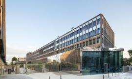
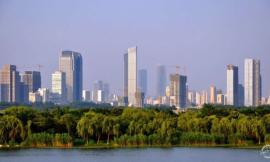
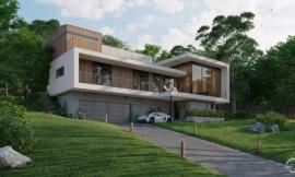
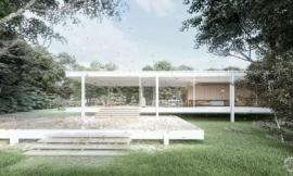
来自专筑编辑刘庆新的报道。简直不敢相信我竟然还没有在微博上写过关于天空的博文。大多数情况下,天空能帮助完成一张建筑图,也能毁掉一张建筑图。我看到许多人忽视了这一点,或者他们只用几分钟就完成了天空的渲染。重点是,一个好的天空渲染能反映图象的整个基调。我花了一点时间梳理网上的图,来为我的图景找到最适合的一张。下面是几张不同的图,你会发现,只是图中的天空改变了,但是图的整个基调和色调都完全不一样。
我把关于怎么设计完美天空的一些想法罗列出来。这些只是一个引导,因为这些并不适用于所有的建筑图的方案和情形。但是,我发现这些办法很管用,在我创建的每一张图中,我几乎都遵循了这些方法。
I can’t believe that I have not written a post about skies yet on this blog. In most cases, a sky can make or break an architecture illustration. It’s also something that I see a lot of people overlook or only spend a few minutes on in their renderings. The thing is, a good sky sets the entire mood of an image. Because of this, it’s my first priority as soon as I get into Photoshop. I spend quite a bit of time combing through images online to find the perfect one for my scene. With the different images below, you will see how much the mood and tone shift from just changing out the sky.
I have put together some ideas to think about when looking for that perfect sky. It should be noted that these are guidelines. There are many of different scenarios and situations in architecture visualization in which these tips may not apply. However, I have found that to be rare and I follow these ideas in almost every image that I create.
1. Avoid Oversaturated Color/避免颜色过饱和
颜色过饱和是我经常发现的问题。许多网上的天空图都有这个问题,因为天空效果被加强或放大,使得太生动和过分吸引观察者的注意。但是,天空颜色的过分饱和会压倒建筑和地平面的颜色,使图失去层次感。为了纠正这一点,我进入“图象>调整>色调/饱和度”,将“饱和度”滑动条移到左边来移除一些颜色。
Oversaturation is an issue I see often. Many of the sky images that I find online have this problem because the sky has been enhanced or amplified to be more dramatic and catch viewers attention. However, too much color saturation in the sky will overpower the colors in the architecture and ground plane ruining the hierarchy of the illustration. To fix this, I go into “Image>Adjustments>Hue Saturation” and I move the “Saturation” slider to the left to remove some of the color.
2. Avoid Awkward or Unnatural Colors/避免生硬或不自然的颜色
颜色不自然带来的问题和颜色过饱和产生的问题相似。不自然的天空颜色从开始就能毁掉整张图,很难设计出成功的作品。不仅如此,颜色不自然的话,设计图看上去就像是一张照片,建筑和地面看上去一点也不和谐。由于许多层次感和色彩基调,我更喜欢另找一张天空图,而不是试图改变这种不自然的颜色。但是,如果我真的喜欢乌云密布的样子或图象的纹理,有时我会减小颜色的饱和度,然后用不同天空的色彩覆盖在顶层。
Unnatural color brings with it similar issues as oversaturation. Unnatural sky color can throw the whole image off from the start making it difficult to pull off a successful composition. Not only that, it creates a “Photoshopped” look instead of looking harmonious with the architecture and ground plane. Due to the many gradients and color tones, I prefer just finding another sky vs. trying to alter or fix the unnatural colors. However, if I really like the cloud forms or texture of the image, I sometimes will desaturate the color, and then use the color of a different sky overlaid on top.
3. Minimize Overly Busy Skies/尽量减少过度繁忙的天空
你可能很喜欢有云的天空,但是太多的云朵会破坏图的可读性。简单地说,它们会喧宾夺主。不过,在分散注意力和生动之间存在着一条界线。我是喜欢有云的天空,但是我会通过降低颜色饱和度和弱化细节来减淡图象,这样,图象纹理就会柔和一些。弱化细节一个简单方法就是找到一个只有颜色、没有云的天空作为基础天空背景设置。然后,找来有云的天空设置在只有颜色的天空图层的顶层,并降低透明度,这样云就会变淡。
As much as you may like clouds, too many will hurt the reading of the image. Simply put, they take all of the attention away from the architecture. However, there is a fine line between distracting and dramatic. I tend to like cloudy skies, but I will dilute the image by desaturating the color and fading out the detail so that the texture is softer. An easy way to fade the detail is by finding a sky with no clouds, just color, and setting that as the base sky. Then take the cloudy sky, set that layer on top of the just-color sky, and lower the opacity so that the clouds read much lighter.
4. Wrong Sun Direction/错误的太阳朝向
这就是其中的一种情形,你看这张图的时候,觉得有地方不对劲,但是又不知道哪里不对。但是,一旦光线来源问题纠正后,图象会看上去非常好。在其他图片元素中同样能反映出这个问题,比如周围环境产生的影子和树木的影子。相关元素的光线来源越正确,整张图看起来就越逼真,而不是所有图片元素的粘合。
This is one of those situations where you look at an image, and something seems off, but it is not clear what is wrong. However, once a light source issue gets corrected, the image reads dramatically better. This holds true for other Photoshopped elements such as entourage shadows and trees shadows. The more that the light source of all of the elements relate, then the better the entire image will read as a single cohesive illustration instead of a bunch of single Photoshopped elements.
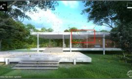
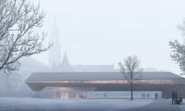
5. Look for the Correct Perspective/寻找合适的透视
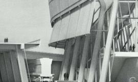
这个方法的重要程度要由视野来决定。但是,如果图象中的天空渲染展示的透视正确的话,表现一定深度的场景将会更有可读性。上图可以作为一个例子。图中,云几乎没有透视,意味着随着距离变化,云朵在程度上没有任何改变,这样,背景看上去就很假。
This idea is more important or less important depending on the view. However, scenes showing a lot of depth will read much better with a sky that shows the correct perspective. In the example above, the clouds have almost no perspective, meaning the clouds don’t change in scale as they recede into the distance and get closer to the horizon which causes the background reads much flatter.
6. Don’t Be Afraid To Go Simple/不用害怕走简单化路线
你不用总是需要展示出空中的云。有时,最完美的层次感只需要图象设置合适的色调即可。这样就会创建一个更平和的场景,帮助突显建筑和地面。
You don’t always need to show clouds. Sometimes, the perfect gradient is all that is needed to set the right tone for an image. This move creates a calmer scene and helps to highlight the architecture and ground plane.
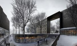
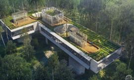
The Final Image/最终效果图
我最后选择的是云中带有一小块儿蓝的天空。这样能看出来太阳光线是从左边射出来的,整个图的光线看上去很生动并有层次感。我用类似tip #3中所描述方法将两张不同的云图结合起来。一张天空没有云,颜色很深,另一张是有云的天空。通过调整有云天空的透明度, 我得以在颜色和柔和度之间找到平衡点。
The sky I ultimately chose was a cloudy one with pockets of blue. This allowed me to play up the sunlight coming from the left and give the overall image a dramatic light to dark gradient. I combined two different cloud images using a similar process as described in tip #3. I found a sky with no clouds and great color and then combined that with a cloudy sky. By adjusting the opacity of the cloudy sky, I was able to zero in on a good balance of color and softness.
一旦图中天空渲染完成,我通过设置颜色图层和在图象底部增加更多阴影,增强了暖色调和冷色调。所有这些操作会帮助人们的目光从图的左侧慢慢移到桥上的右边,再到右边的火车,人行道也随之进入眼球。我就通过天空的光线来讲述着项目的“故事”。
Once I had the sky, I amplified the warm and cool tones using color overlays and added more shadow at the base of the image. All these moves help to start the viewer’s eye on the left side of the image, and slowly move it to the right over the bridge and to the train on the right, mimicking the path pedestrians take. In this way, I am using the light started by the sky to help tell the story of the project.
出处:本文译自visualizingarchitecture.com/,转载请注明出处。
|
|