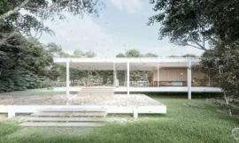
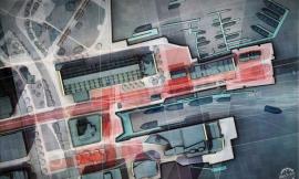
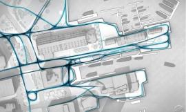
In the previous wharf post, I discussed black and white texture studies that focused on pattern and ground plane elements throughout the wharf. The above image builds off of those studies introducing color and material. Site plans are extremely useful in the design process and I wanted this one to be somewhat malleable as I tweak things.
The wharf is on a strong axis with Boston’s Old State House. I wanted to be able to study this connection as well as the wharf’s relationship to the dense city fabric. The site plan was therefore setup to include this information which meant creating one of the highest resolution images I have ever done. The above image tops out at 10,000 pixels tall. Typical illustrations for me are around 4,000 to 5,000 pixels on the longest edge. The high resolution was needed to be able to study different spaces and textures up close. However, this will also allow me to crop out several close-up images for presentations allowing me to get lots of mileage out of this one site plan.
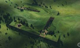
To manage the high resolution, I rendered out two 5000×2300 images seen below. To speed things up, I didn’t worry about adding texture or material in the Kerkythea rendering. I knew I would be experimenting with textures in PS and didn’t want to have to worry about baked in materials. I only needed the shade and shadow so I rendered some clay models and stitched them together in Photoshop.
The final PSD file can be broken down into three main sections. I used an aerial image to get much of the existing texture information of the roads, buildings, etc. The aerial was overlayed on top of the clay model with a lowered opacity. I then took the black and white texture studies from the previous post and worked that information into the new site plan. Since all of the line work elements were separated and grouped in the previous PSD file, it was easy to make adjustments and extend the ground plane elements to the Old State House. Finally, I added texture, color, and vegetation on top of everything.
With the site plan far along, I’m ready to start diving into some perspectives. I hope to get going with those in the upcoming posts along with some portfolio spreads. I’m thinking about setting up a vertically oriented portfolio layout as this is a more common layout with the online printers. More to come on this later.