Making of “IRACEMA” in the Dusk
由专筑网vigo,刘庆新编译
Santi Sanchez的博客上增加他的新项目“IRACEMA”。他在之前上传的“水晶盒子别墅制作”的帖子大部分为后期制作,而这次的作品则是纯3d写实制作。让我们具体的来看下Santi的制作过程吧。
tresde’s Santi Sánchez makes a new appearance on the blog with his recent project “IRACEMA”. He previously posted the making-of ‘Crystal Box’ Villa, which was mostly post-production based and now we can see a mostly pure 3d / photo-realistic base approach. Follow Santi as he goes about describing his process from start to finish below. Enjoy!
前言/Introduction
大家好,首先感谢Ronen再次邀请我来ArchViz社区讲解我最新作品的制作。
我希望用IRACEMA项目来提高我目前在ArchViz的工作流程,以达到商业化所要求的快速制作。我知道这个目标很寻常,但实际上,在这个过程中,我在短时间内发现了很多有趣的指导性意见。
我非常高兴能和大家分享这些技巧以及我作品背后的哲理。
在开始之前,我先要跟大家分享我每个作品背后的想法。
对我而言,图片有两个非常重要的部分,一是美,这决定于作品的构图、色彩、扎实的基本功、知识,以及对摄影与真实世界如何运作的理解。
第二点则是技术层面。这决定于合理的运用制图工具及软件,了解所有软件的兼容性。这很重要,如果我们详细的了解这些工具以及使用方法,我们将会受益匪浅。
如果我们可以平衡美和质量,我们的作品将不会大跌眼镜。
在这个项目中,我用到的插件有3dmax2014,Vray3.3, Solid Rocks,Forest Pack pro,Siger Shaders,Photoshop Cs6, Red Giant Magic Bullet 和Nik Software。
Hi, everyone!
First of all, I’d like to thank Ronen for inviting me yet again to contribute to the ArchViz community with this making-of about my latest project.
IRACEMA project was born with the idea to improve my current ArchViz workflow, with the aim of delivering results with a commercial characteristic in the shortest deadline possible. I know this kind of goal could sound so trendy or most of the time quite usual, but actually, during the process I’ve found some very interesting guidelines that helped me to achieve exactly the results that I was looking for in a short amount of time.
It is a pleasure for me to share with all of you this techniques and of course the philosophy that is behind my images.
Before I start, I’d like to share with you, my thoughts behind every single project I make.
To me, an image has two important parts, the first one is the beauty and this is given by the composition, the palette, a very solid foundation, knowledge, and understanding about how photography and real world works.
The second one is the technical aspect and this is given by a proper use of the tools that we choose for the project, knowing all the capabilities of software and hardware. These are crucial, because we can take a huge advantage if we know exactly what we have and how we can use it.
If we can balance 50/50 beauty and quality, there is no chance to fail or at least have an undesired result.
For this project, I used 3ds Max 2014, V-Ray 3.3, Solid Rocks, Forest Pack Pro, Siger Shaders, Photoshop Cs6, Red Giant Magic Bullet and Nik Software.
参考图片/References
在所有项目的初期,找到好的参考图片是非常重要的。
我在IRACEMA的网站找到了一些图,并将此来作为构图和灯光的参考。
One of the most important steps at the beginning of any project is getting the right references.
I’ve found the IRACEMA’s gallery (Website) with a very interesting kind of moods, so I decided to use them as a base in terms of composition and lighting approach.

初期设置/Initial Setup
我通常在3dmax和Vray里使用线框图。以下是所有设置。
I always start my setup using the Linear Workflow for 3ds Max and V-Ray. Here are some images with all the information.

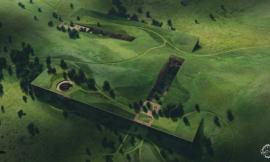
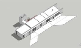
3d 建模/3d Modeling
我将依据我在EBArquitetura里找的蓝图来进行建模。我先用cad制图之后将其导入3dmax里建模。剩下的细节则单独导入。
I based most of the 3d model on the blueprints that I’ve found from EB Arquitetura website. I used Autocad for the architecture modeling and I imported to 3ds Max. The rest of details were added during the process as an interpretation without diverting from the main concept.

大部分的模型是我资料库里的既有模型,这将减少模型制作的时间,而我将根据参考图片来调整部分材质。
The majority of the 3d models are pre-built models (Evermotion) that I have in my personal library so this reduced the modeling process and I just customized some shaders according to the references.

关于场地设计和环境设计,我采用Forest Pack Pro来制作石头、草以及周边的树木。对于靠近建筑的植物,我手动处理,并保持构图合理。
About the landscape and environment creation, I used Forest Pack Pro in order to generate and scatter the gravel stones, grass, and the surrounding trees. For the specific vegetation near to the architecture (cactus and small trees), I placed them by hand trying to follow the composition guidelines.

纹理与材质/Texture & Materials
对于场景材质,我采用Siger Shaders 作为基础,并根据项目需要进行调节。我将所有材质尽可能的简化,大部分的材质只保持基本元素(默认贴图、反射贴图以及凹凸贴图),而所有这些都以参考图为原型,因此采用预设的shaders模式将便于个性化调节,避免浪费时间在创造全部景象的过程中。
我必须要跟大家解释下水池的材质。这个材质的折射非常微妙,但后期完全能接近我要的效果。
About the scene materialism, I’ve used Siger Shaders as a base and I customized them according to the project needs. I’ve kept all the shaders simple as possible, most of them has a basic structure (diffuse map, specular map, bump map) and all of them are based on references, so using pre-set shaders will give the chance to customize them in the easiest way, without spending too much time dealing with the full creation process.
I’d like to explain the pool water shader. This shader has a tricky refraction but at the end, the result was quite close to my reference.

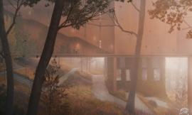
灯光/Lighting
灯光是我非常喜欢且愿意研究的部分。在我看来,采用HDRI灯光是建立呼应真实场景非常有效的方式。
在创建主光源的时候,我们有多种选择,而我喜欢在构图的一侧设置暖色调的光源,创建光的细微衰减,让光显得真实,同时避免太平淡的天空或者背景色。
对于室外,我采用了一个带有HDRI贴图的球灯,室内则采用了一个矩阵的聚光灯(带有vray阴影和vray平面)。靠近天花板的灯采用了vray灯光材质来表达灯泡的发光和光照度。
Lighting is one of the stages that I really enjoy designing and develop. In my personal opinion, HDRI lighting technique is one of the most useful and realistic ways to generate a very responsive and accurate result.
We can have several options at the moment we decided to locate the main light source (Sun), as a personal taste most of the time I like to include in one of the sides of my composition a warm spot (Sun) and create a subtle transition from warm to cold, from light to shadows. This kind of transition gives a more natural feeling to the scene and avoids having a flat sky pattern / color at the background.
For the exterior, I used a dome light linked with an HDRI bitmap (Peter Guthrie’s PGSKIES 2028), for the interior lights I used a mix of standard target lights with V-Ray shadows and V-Ray planes. Small lamps attached to the ceiling has a V-Ray light material to simulate light bulbs reaction and photometric lights with IES attached files.

渲染/Rendering
我觉得对于很多人来说,渲染都是一个瓶颈或者噩梦,最简单有效的方式是采用传统的插件Solid Rocks。
Solid Rocks有专门的vray设置(对于最新vray版本)。如果你了解vray设置,那么solid rocks界面对你来说就很简单,几乎就和vray的界面差不多。对于那些不怎么关心vray渲染的人来说Solid Rocks非常实用。
我决定采用这个并用我的常用的设置来进行对比测试。效果差别并不大,而且我非常满意这个结果。
I guess this could be a “nightmare” or a “bottleneck” for most of us, once again trying to apply a simple but effective workflow I decided to give a chance to a very old but useful plugin, Solid rocks.
Solid Rocks has a unique approach to V-Ray settings (which was kind of done in the recent versions of V-Ray). The interface is quite simple to deal if you have a basic knowledge about V-Ray settings options, basically is like a more intuitive and friendly V-Ray settings interface. Following the philosophy explained at the beginning, Solid rocks could be a practical solution for people who aren’t interested to know how exactly V-Ray render works (funny, I know… maybe just don’t want to dive too deep and technical about all the settings).
I decided to use it and test it with my “usual” settings and the difference wasn’t a huge gap so I gave it a chance and I was pleased with the final results.
设置如下/Here the setup :

平时,我喜欢用vray元素,这方便我控制快速选择、灯光、对比、反射、折射等操作,但是在这个项目中,我只采用了Vray raw 全局光照明方式。
Most of the time I like to use the V-Ray elements that allows me to control quick selections (object id), light, contrast, reflections, and refractions, but for this specific project I just used the V-Ray raw Global Illumination pass.
后期处理/Post Production
最后,我完成所有渲染,进入整个过程的最后阶段,现在将是见证奇迹的时刻。
在我看来一个项目,其构成要素是起点,而参考图标则更加直观地给出最后结果的预测。
再次申明,我将尽量简化后期制作的工作流程。一开始,我将调整vray raw全局光并增加一个自然饱和度的调整层,以避免影响到室内的灯光饱和度。之后我将混合一些污渍的纹理给左边的混凝土。
Finally, we reached the final stage of the full process and here is where “magic” happens.
As I see a project, the composition will be the starting point and the use of a reference will give you a more specific idea about the final result to achieve.
Once again I will try to keep my post production workflow simple as possible. I will start blending the V-Ray Raw Global Illumination pass link it with a Hue / Saturation adjustment layer to avoid oversaturated interior light temperature. After that I will blend some dirt texture for the concrete volume at the left side.

因为所有的渲染都在3dmax和vray里完成了,因此我可以通过3dmax所渲染的通道图进行色彩选择。只有这样,我才能对单一色彩进行调整,这样做的主要意图也是保证色彩和材质的渐变和交接,也正因为这样的图层,所有的色彩都可以被调整,以达到一个和谐统一的色彩色调。
色彩平衡非常好用,在这一步中,合适的参考图起到了非常重要的作用,引导我们做出一样效果的图。或许做出好的效果图的秘密就是参照一样的效果图来制造我们的灯光环境。
我们也可以通过调整层例如自然饱和度等,将所选择的色彩调节成参考图片的样子。
Because everything was done inside 3ds Max and V-Ray right now I can start with the color correction part of the process so I will start using a Selective Color adjustment layer because only this adjustment layer allows me to control every single color on the scene and the main idea behind this is try to keep with the subtle transitions between colors and temperatures, because this layer has pretty much all the colors and 4 sliders to customize each one, the flexibility is just so great and helps get a homogeneous result in terms of colors and tones.
The color balance combinations are unlimited, so this is the stage where having the right reference is crucial in order to emulate the same color scheme in the render. Probably here the “secret” is to respect the light conditions that we have in our render and find a reference with the same characteristics, this will give more sense to our final result.
We can use as well adjustment layers like Hue / Saturation or Curves to complement the previews correction with the Selective Color adjustment layer.

好了,现在我将要开始处理环境中的实物了。例如,灯泡的发光。我们可以非常容易地在ps里绘制灯泡的发光,但光不是无色的,而是有色温的,并且是出于曝光状态,因此我们可以调整我们图片中的曝光。
Now is time to put attention on the physical reactions that we can find in our scene. For example, light bulbs glare/glow. We can paint light easily in Ps just taking in consideration that light doesn’t have a color, light has a temperature and at the same time is an over exposed effect that we can control just over exposing our image.

在最后的一个阶段里,我将要使用我最爱的两种ps插件:神奇的子弹photolooks以及Nik软件。
主要的目的是为了模糊并且融合之前的调整,所有的场景在色彩、对比度、饱和度和漫反射方面都要保持天衣无缝。
在制作夜景时,我们必须理解光具有漫反射的性质,通过降低快门速度来平衡曝光度以达到真实的光照情景。因此当你不是很确定光的反射时,请参看下真实的照片,你将会创造出更真实的场景。
For the finalization part of the post production process we are going to use two of my favorite Ps plugins : Magic Bullet Photolooks and Nik Software.
The idea is to try to fuse and merge all the previews corrections, all the scene has to look seamless in terms of color, contrast, exposure, saturation, and diffusion.
As a night scene we must understand that the light behaviour will have a very diffuse characteristic so is very important to keep this in mind, because this is a physical reaction of trying to balance the exposure using a low shutter speed value, so when you are not sure about light response please check a real photo and you will be able to recreate this and other effects in a more accurate way.

因为真实的照片没有完美的抗锯齿,我们可以用Nik里的Analog Efex Pro来模糊抗锯齿所带来的清晰度。这将会提高真实性。
色差是永恒的话题,在摄影里,这会是一个需要被更正的错误,但讽刺的是,这个缺陷在照片里非常常见,因此人们看到这个色差的时候总会觉得这是真实的图片。因此可以通过这个色差来强调这个是真实的照片。
我个人的建议是不要滥用这个效果,如果要用,请你确认你理解其原理并且知道在什么情况下这是错误的。
另外我觉得这个插件不错的地方是可以储存这个设置并且反复使用,这样可以确保同类图片都可以采用这个模板。
Because real photos don’t have a perfect anti-aliasing (AA) we can use Analog Efex Pro 2 from Nik in order to blur a bit (just a bit) the anti-aliasing definition. This will give a more natural sensation.
Chromatic aberration (CA) is a very “controversial” topic because, in photography this is actually an error and needs to be corrected but ironically this imperfection is quite common in photos so because of this when the human eye sees chromatic aberration in any image (render / photo / illustration) automatically thinks that is a “real” picture, so you can use it to emphasize the photoreal look.
My personal suggestion is to not abuse this effect, and if you are going to use it be sure you understand why and under which specific situations this error can happen.
Something that I really like about these plugins is that you can save the preset and reuse it for all the views so this ensures having the same result in every single image.

作为最后一步,我要采用高通波滤镜来锐化这个照片,以便我们以后降低这个图片的尺寸时不失去图片里的细节。
As a final step, we can use a high pass filter to sharpen the image and ensure if we are going to reduce the size to use it for the web we are not going to lose any information and definition.

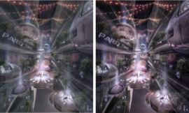
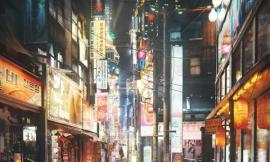
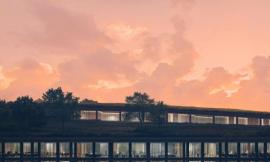
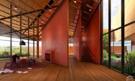
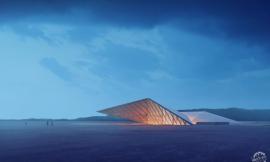
最终渲染图/The Final Image :

镜头前/镜头后渲染图/And Before / After shots (Animated GIF’s) :


最后建议/Final Comments
创建一套比较现实的工作流程,尽可能多的使用有利的工具,是我做这个项目的基本方法。
虽然每个工作流程的不同之处正是我所希望的变化,但是我们在这个过程中必须花时间思考,在商业环境中,时间就是金钱,而在个人创造中时间是自由的,因此,我并没有用到很多秘密手法,超难技法,或者工具去制作这个图片。
让过程中所有的流程变得简单是很有利的。灵活调整图片去适应任何一个场景很有必有。另外,也有些客户需要特殊处理的图片,在这种情况下,我们必须清楚这个图片的真正用途。
我希望你们能够享受这个过程,我很感激能够有机会分享photolooks和nik preset,希望你们能够觉得有用。
Create a practical workflow taking advantage of many tools we can get, is basically the way that I used to create this project.
Probably the difference about this workflow and other ones is I like to cover and control every single variable, must of time we can spend a lot of time trying to guess during the whole process and in a commercial environment time means money and in a personal environment means freedom, so I haven’t used any secrets, hard techniques or tools to create this project.
Keep all the things inside the workflow simple is just an advantage. Be flexible and learn to customize is the key to adapt any content to a project, but of course, on the other hand, there are projects and clients that demand specific models, shaders etc. In such cases, we have to be clear about what is the real purpose of the image.
I hope all of you guys enjoyed this making of, as a way to thank you for this opportunity I’d like to share the Photolooks and Nik presets, hope you find them useful.
出处:本文译自www.ronenbekerman.com/,转载请注明出处。
|
|