斯德哥尔摩设计实验室为爱立信设计的“第一数字”标志
Stockholm Design Lab creates "digital-first" identity for Ericsson
由专筑网王帅,李韧编译
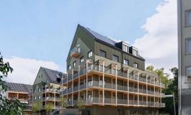
斯德哥尔摩设计实验室(Stockholm Design Lab)为瑞典爱立信科技公司设计了新的标识,该标识是在其数字设备上运用文本和图标,而不是直接使用物理品牌标识。
在巴塞罗那举行的世界移动大会(Mobile World Congress)上,爱立信公司更改了标识,同时,品牌负责人强调了手机和电脑屏幕的功能。
斯德哥尔摩设计实验室(SDL)的新标识采用了原爱立信标志的更高分辨率版本,即三条带有弧形边缘的黑线,新标识的字体更清晰,图标更简单。
Stockholm Design Lab has created a new identity for Swedish technology company Ericsson that prioritises text and logos on digital devices, rather than physical branding.
Revealed at his year's Mobile World Congress in Barcelona, the rebrand places an emphasis on functionality for mobile and computer screens.
Stockholm Design Lab's (SDL) new identity features a higher resolution version of the original Ericsson logo – three black lines with rounded edges – a clearer typeface, simplified iconography and a minimalist webpage design.
斯德哥尔摩设计实验室创始人Björn Kusoffsky说:“新标志是爱立信对简明化、诚信和提高生产力的承诺,该作品意味着爱立信志在摒弃过去的一些在徒有其表的事情上所废的功夫。”
设计师说:“新的品牌标识更加注重产品的功能而非美学,旨在为简单的通讯和产品性能而努力,这是爱立信技术专长的映射。”
此次更改标志是爱立信立志成为“真正的数字品牌”的部分计划,爱立信方称这些是“对企业战略和品牌承诺的回应”。
"The digital-first brand identity promises simplicity, trust, and enhanced productivity and SDL's work is a response to the aim of making complexity a thing of the past with little space for ambiguity and meaningless decoration," says Björn Kusoffsky, founder of Stockholm Design Lab
"The new brand identity focuses on functionality over aesthetics and aims to provide tools for simple communication and product performance, thus reflecting Ericsson's technical expertise," said the designers.
The rebrand forms part of Ericsson's plans to become a "truly digital brand", with the company describing the changes as a "direct response to the business strategy and brand promise".
为了设计一个完美的标志,设计师将标志的几何形状与像素网格结合,使它更加清晰地呈现在屏幕上。
在新的标志中,设计师使用了一种名为希尔达(Hilda)的易读字体,它以公司创始人希尔达•爱立信(Hilda Ericsson)的名字命名。
设计师说:“希尔达字体反映了爱立信对当下的业务需求,它是未来的通用品牌的一大优势,随着爱立信的不断发展和变革,它将整合到所有公司的应用程序中。”
To create a smoother identity, the geometry of the logo was altered to align with the pixel grid, meaning it would appear clearly rendered on digital screens.
A new easy-to-read typeface called Hilda – named after one of the company founders Hilda Ericsson – also features in the rebrand.
"Hilda expresses Ericsson's business needs for today and is a versatile brand asset for tomorrow integrating across all company applications as Ericsson continues to evolve and transform," said the designers.
颜色的风格为明亮和高对比度的色调,有蓝色,红色,橙色,黄色,绿色,紫色和冷灰色。
设计师说:“色彩设计方案源于数字界面和信息设计原则。”
他继续说:“与国际上明亮且绚丽的色调相反,我们选择的色调主要是为了帮助用户明确关键信息,而不是通过不必要的装饰来分散他们的注意力。”
The colour palette was also tweaked to feature bright and high-contrast shades, including blue, red, orange, yellow, green, purple and cool grey tones.
"Our approach to colour is born from digital interfaces and information design principles," said the designers.
"The tones we have selected are digitally native, internationally bright and rich in contrast. The accent colours are primarily intended to help guide the user towards key messages and interactions, rather than distract them through unnecessary decorative usage," they continued.
更改标志后,网站的导航更加清晰明确,文字也变得更少,这有助于推动网站变得愈发全面。
同时,斯德哥尔摩设计实验室也注意到了互联网和移动设备上表情符号使用量的增加,所以在公司网站上增加了图标的数量。
The rebrand comes alongside a redesigned website, which is updated with clearer navigation and less text. This contributes to an overall cleaner website design.
Noting an increase in the use of emojis on the internet and mobile devices, Stockholm Design Lab increased the number of icons used on the company's website.
他们说:“互联网和手机的使用推动了图标文化的发展,并使人们对象形文字和表情符号有了更好的理解。”
他们解释说:“这些都反映在当下用户的交流和体验之中,爱立信品牌2.0考虑到这一点,简化了风格,并重新定义了商业意图和发展方向。”
"The internet and mobile usage has fueled icon consumption and created a greater understanding of pictograms and emojis in general," they said.
"This is reflected in the communications and user experiences of today," they explained. "Ericsson Brand 2.0 takes this into account by simplifying style as well as reimagining business metaphors and meaning for tomorrow."
如今,越来越多的品牌选择精简图标,例如约会应用Tinder,设计师将原先的文字图案改为了火焰图标,而文件传输软件“WeTransfer”的图标则是一个小小的“We”。
An increasing number of brands are opting for stripped-back identities, including dating app Tinder that replaced its text logo with an alteration of its flame icon and file sharing service WeTransfer that ditched the "Transfer" part of its logo for a more minimal "We".
出处:本文译自/www.dezeen.com/,转载请注明出处。
|
|
专于设计,筑就未来
无论您身在何方;无论您作品规模大小;无论您是否已在设计等相关领域小有名气;无论您是否已成功求学、步入职业设计师队伍;只要你有想法、有创意、有能力,专筑网都愿为您提供一个展示自己的舞台
投稿邮箱:submit@iarch.cn 如何向专筑投稿?