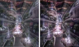
Site Texture Study: Round Two
由专筑网王子铭,李韧编译
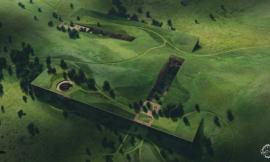
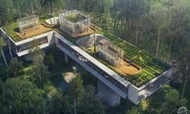
2014年,我为自己的码头设计做了这样的黑白图纸。我喜欢将这种复杂的总平分解成简单的图层元素,同时创造出一种由简单图层快速绘制总平空间的方法。对于这种桥梁设计,我决定使用类似的流程,同时进行一些细微的调整,仍然去除所有的色彩饱和度,将元素抽象到最简的形式,而现在对阴影的处理需要更微妙的理解,这样才能使作品产生更好的空间感。虽然一开始看起来有许多制图步骤,实际上,这种图像处理起来比你想象中要快许多,但均是通过越来越多的简单信息慢慢叠加而形成,同时每个步骤都是建立在前一步顺利完成的基础上。希望这些做法可以在下面的图像中表达清楚,当然利用好Photoshop的图层、智能对象等控制图像的操作是完成这张总图的前提。
I first generated a black and white study like this for my wharf design back in 2014. I liked how this approach breaks down the complexity of site design into simple elements and creating a space for me to quickly “sketch” out and iterate ideas. For this bridge design, I decided to use a similar process with some minor modifications. I am still removing all color and abstracting elements to there most simplest form. However, the shadows now have a subtle gradation to them to give a better sense of depth. An image like this comes together faster than you might expect. Although it looks like there are a lot of moving parts and finite detail, it is all about starting simple and slowly building in more and more information. This idea hopefully is clear in the image breakdown below where each step slowly builds off of the previous. It goes without saying that Photoshop file organization is important and using groups, masks, and smart objects play an important role in keeping my PSD file under control and eaisly editable.
1. 基本图层
Sketchup线性工作流程建模,导出线稿与阴影图层,而后在photoshop中进行叠加组合。
1. Base Images
Sketchup line work and shadows (I exported the line work and shadows as two different images and then combined in Photoshop).
V-Ray单色覆盖材质模型渲染,通过调整V-Ray选项编辑器,将太阳的尺寸调至100,这样能够得到边缘相对柔和的建筑阴影。
V-Ray clay model rendering. I went with really soft shadows by simply increasing the sun size in the V-Ray option editor to 100.
然后,完全去除V-Ray渲染模型的材质饱和度,调整到正投影,获得对比度更强的柔和阴影。
I then took the V-Ray clay model rendering and totally desaturated the colors and edited the levels to get a stronger contrast.
最后,将V-Ray渲染的柔边阴影图像叠加在Sketchup导出的线稿阴影底图之上,并将图层混合模式设置为“正片叠底”,从而得到图像中的效果。
Finally, I took the V-Ray clay model rendering and set the blend mode to “Multiply” on top of the Sketchup line work and shadow export to get the composited image above.
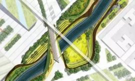
2. 定义街道及周边建筑
为了将车行道路与人行道路分开,我降低了车行道与周边建筑的灰度,但为了让其不至于太抢眼,所以只进行了微调,能够突出这些功能元素即可。
2. Define Streets and Context Buildings
To help separate the street from the sidewalk, I added a slight tone to the streets and context buildings. I didn’t want this move to grab too much attention, so the tone is very light. Just enough to define those elements.
3. 建筑的轮廓与框架
为凸显建筑的边缘,我将其外轮廓线加粗,同时增加的网格线也反映出建筑内部的结构框架。
3. Profile and Grid
To define the edge of the site, I wrapped a thick profile line around the perimeter. A grid was added as well to provide a framework for the site design.
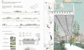
4. 功能分区与路径
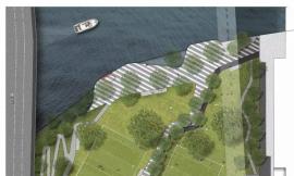
这一步,我开始用色块粗略的描绘出项目的功能分区和路径,在制作过程中,我尝试运用不同的灰度来表达草、灌木、石材、铺地等材质的变化。
4. Zones
For this step, I began roughing the programmatic zones and pathways of the project. I iterated quite a bit at this stage before arriving at this design. The different gray tones are representing changes in materials such as grasses, shrubs, crushed granite, changes in paving materials, etc.
5. 细节与纹理
为了使人们更加关注项目,我将建筑与周边环境区分开,因此在总图设计中叠加了细腻的纹理,同时增加更多的细节,如运用点状元素来代表灯具。
5. Extra Detail and Texture
I was looking for a way to call more attention to the project and hierarchically separate it from the context, and therefore draped a light texture over the design. I also added a few more details such as dark elements representing locations of possible light fixtures.
6. 批量复制元素
桌椅、汽车、树木均体现在图纸中,为了在图面中更好的展现现场停车位的数量,并且体现出与汽车主导的交通环境形成对比的绿色人行通道,我在图面中增加了汽车配景元素,在配景素材上,我仅使用了三个智能对象,并进行多次复制,因为如果我稍后决定用其他素材替换树的图形样式,只需要替换一个智能对象即可。
6. Mass Copied Elements
Trees, cars, tables and chairs were populated throughout the illustration. I debated whether or not to add cars, but ultimately decided that they would better reveal the amount of parking lots around the site and create a clear juxtaposition between the car dominated context and the green pedestrian focused project above. I am only using three different smart objects copied many times. Therefore, if I decide later to replace the graphical style of the trees with something else, I simply just replace the one smart object.
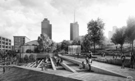
7. 最终合成及颜色校正
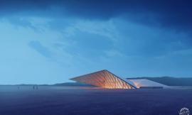
利用微小的颜色校正,给阴影附上微妙的蓝色色调,高光部分则为暖色,形成冷暖对比。同时我还叠加了一些噪点,增添图像的纹理。整个图面表达越来越接近我所想要的效果,接下来我打算制作一些透视图来研究沿街商铺的不同活动场景,敬请关注。
7. The Final Illustration and Color Correction
Color correcting was minimal by giving the shadows a subtle blue tint and the highlights a warm tint. I also added some noise for a little more texture. The design is getting close to where I want it and up next I plan on producing some perspective illustrations to study a few areas along the retail corridor. Stay tuned.
出处:本文译自visualizingarchitecture.com/,转载请注明出处。
|
|
专于设计,筑就未来
无论您身在何方;无论您作品规模大小;无论您是否已在设计等相关领域小有名气;无论您是否已成功求学、步入职业设计师队伍;只要你有想法、有创意、有能力,专筑网都愿为您提供一个展示自己的舞台
投稿邮箱:submit@iarch.cn 如何向专筑投稿?