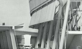
Exploded Axon
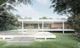
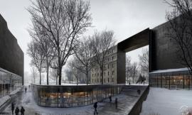
我一直迷恋于结构分解轴测渲染图。它们给静态的物体添加了活跃的元素。进一步说,我喜欢一个成功的轴线分解图的原因是它有清晰容易理解的设计元素,而不仅仅是依靠单个立面或者他们奢华的内部来体现。相反,这种类型的渲染图强调了不同元素的关系,且每个元素都发挥出了最大的作用,成为整体中不可缺少的一部分。我喜欢在介绍中看到这些类型的渲染图,因为它给观众展示了已经经过深思熟虑的建筑的构造。
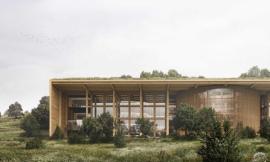
在开始上面的渲染图时,我确实不知道设计的最终的结果成为一个不错的范例。我探索了不同的想法,例如将建筑横向的分隔或使用一个简化示意图。然后我决定把完整的设计放在底部,而把分解的元素置于上方,位于水平视线的位置。我这样做的原因有两个:首先,这可以允许观察者清楚明了地将分解元素从未分解元素中区分出来。此外,通过将未分解的建筑置于图片最下端,而不是在旁边,这样重点仍然是在水平视线的分解元素。
I have always been intrigued by exploded axonometric illustrations. They add a kinetic aspect to what is typically very stagnate fixed objects. Even more though, I like how a successful exploded axon depends on a clear understanding of all the elements of a design, not just a single facade or dramatic interiors by themselves. Instead, this type of illustration emphasizes the relationship between the different elements and the role each element plays to the larger whole. I liked seeing these types of illustrations in presentations because it shows the audience that the techtonics of the design have been thought through.
I started out with the above illustration not really knowing what the end result would look like as is typically the case. I explored different ideas such as separating the building more horizontally or going with a simplified diagrammatic look. I then decided on placing the complete design at the bottom with a copy of the exploded elements above, located at eye level. I went this route for two reasons. First, this allows the viewer to relate the exploded elements to the unexploded design clearly and easily. Also, by placing the unexploded building at the bottom of the page instead of to the side, the focus remains on the exploded elements at eye level.

我把渲染图分成两张,这样可以以更高的分辨率进行渲染,也原因是我渲染了两个区域的地面。如果我把所有东西渲染在一起,未分解的建筑将完全在地面之上的阴影之中。你也看到了,我制作了两个阴影样式,一个带有柔和阴影,另一个带有强烈阴影。就像我上面说的,我不能确定在开始的时候会怎样,所以就准备了两个方案。最后,我将两张图结合起来,这样我就可以在每张图中提取不同的细节元素。
I broke the rendering up into two images so that I could render at higher resolutions. I also did this because I rendered a ground plane in two areas. If I would have rendered everything together, the unexploded building would have been completely in shadow by the ground plane above it. You can also see that I did two shadow styles, one with soft shadows and one with hard shadows. Like I said at the top, I wasn’t sure where the rendering would go at the beginning of the process, so I wanted to have both options to experiment with. In the end, I combined the two which allowed me to extract detail in areas where the other was to dark or didn’t render correctly.

如果 3D模型建的正确的话,轴线的结构分解图很容易创建。当我建模时,每个构建都成组了。通常情况下,模型里所有的面都成为组或者组件。我也整理了一个清楚的组件层级,这样大型的构件例如墙体、屋顶、或者结构可以被轻易的移动和编辑。如果问我怎样在SketchUp创建清楚的模型,那就是要疯狂地想办法成组。图层和成组是不一样的。我通常只使用图层来快速打开和关闭大组件项目,以测试不同的场景或暂时关闭面多的项目,比如模型中的树木。不过,我不使用图层来调出不同的元素,例如窗户、门、墙体等。返回到轴线的结构分解图,一旦群体被建立,分解不同构件的渲染图是不用花费多少时间的。
Exploded axons are easy to create if the 3D model is built correctly. When I build my models, everything is grouped. There typically isn’t one surface in the model that is not grouped or not made into a component. I also have a clear hierarchy of groups so that large systems such as walls, roofs, or the structure can be moved out of the way for easy editing. If I have any advice for creating clean models in Sketchup, it’s to group like crazy. Using layers is not the same as grouping either. I usually only use layers to quickly turn off and on large group items to test out different scenarios or to temporarily turn off poly heavy objects such as trees while I model. However, I don’t use layers to call out different elements such as windows, doors, walls, etc. Back to the exploded axon, once the groups are established, exploding the geometry for the illustration takes no time at all.


因为模型没有任何的材质和大量的几何面,我可以不用太长的渲染时间而渲染出高分辨率的图。我估计每张渲染图大约花费了20分钟。
Because the model didn’t have any materials or a ton of geometry, I was able to render at much higher resolutions without extremely long render times. I’m guessing each rendering took about 20 minutes.

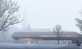
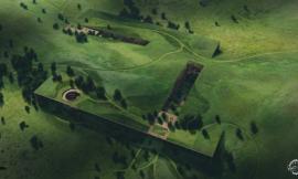
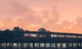
伴随这轴线的结构分解图,很多内容会展现出来,所以我们不需要一个复杂的背景。相反,我专注于色彩,减少与这方面竞争的内容元素。场地是非常宁静的,我喜欢这个想法,把未分解的建筑在底部的田野上安静的放着,所有的动态的分解元素都在上面的感觉。我不想让人们看到地平线,所以我删掉了背景,并让远处有一缕刺眼的太阳光,这样所有的元素看起来结合在了一起。
Exploded axons have a lot going on, so it didn’t seem necessary to have a busy background. Instead, I focused on color and less on content for this aspect. The site is very serene and I like the idea of just seeing the unexploded building at the bottom sitting quietly in the field with all of the action happening above it via the exploded elements. I didn’t want to see the horizon so I washed out the background and made it appear as though there was a large sun glare which helped tie all of the elements together.
出处:本文译自visualizingarchitecture.com/,转载请注明出处。
|
|
专于设计,筑就未来
无论您身在何方;无论您作品规模大小;无论您是否已在设计等相关领域小有名气;无论您是否已成功求学、步入职业设计师队伍;只要你有想法、有创意、有能力,专筑网都愿为您提供一个展示自己的舞台
投稿邮箱:submit@iarch.cn 如何向专筑投稿?