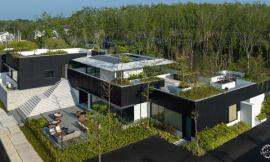
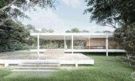
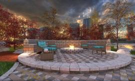
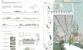
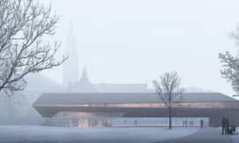
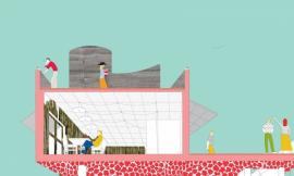
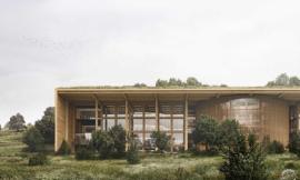
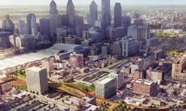
来自专筑编辑刘庆新的报道。过去的几个月我去过缅甸几次,在那里发现一些令人叹为观止的秋叶,这是非常漂亮的景观。这激励我完成我最近的克兰布鲁克渲染图。秋景和标准的景观并没有多大区别,除了树的暖色调和整幅图呈现出的暖色感觉。
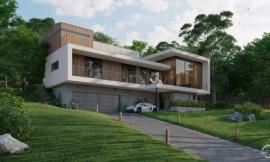
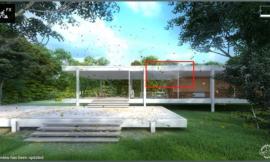
另一方面,我认为鸟瞰图是所有渲染图中最难设计的一种。在Google上很难找到合适的关于景观元素、车、建筑等的图。更难的是,这种景观的背景需要更多周围建筑和景观的模型图。在我的这个方案里,这意味着需要花更多的时间在Photoshop里处理这些元素。但是,额外的努力是值得的,因为这种角度的景能对设计和周围环境之间关系更清晰的理解,这才是我的主要目的。这个设计被位于附近的Saarinen博物馆影响很大。因此,我想尽可能将这种关系清楚而强烈地表达出来。鸟瞰图就符合这个标准。
因为图中有许多树木,还有Kerkythea渲染发展还不够成熟,所以我会用到大量的Photoshop工作。以下就是所有主要元素图层设计用到的步骤。我需要说明的是:尽管下面的步骤看上去清晰明确,实际上在添加树,草地,雾,纹理等元素时还会有一些反复工作。尽管我用下面的步骤整合出了这张渲染图,但它实际上是一个相当反复的过程。
I have taken several trips up to Maine over the past month and experienced some beautiful landscapes with stunning fall foliage. This has inspired the latest illustration for my Cranbrook project. Autumn scenes are not that much different from your standard landscape scene except for the warmer color tones of the trees and overall warmth of the image.
On the other hand, bird’s eye views are, in my opinion, some of the toughest views to illustrate. It is difficult to find Google images at the proper view angle of landscape elements, cars, buildings, etc. On top of that, this view reveals much more of the background requiring more modeling of surrounding buildings and landscape. In my case, it means more time Photoshopping these elements in. However, the extra effort can be well worth it because this view angle can provide a clear understanding of the relationship between the design and its surrounding context which was my main objective. The design sits adjacent to, and is heavily influenced by the Saarinen Museum. I, therefore, wanted to illustrate this relationship as clearly and dramatically as possible, but still keeping the focus on my design. The bird’s eye view met this criteria.
There was a heavy amount of Photoshop work that went into this illustration due to the amount of trees as well as the underdeveloped Kerkythea rendering. Below are the steps I used to layer in all of the key elements. I should note that although the steps seem clear and straight forward, there was actually a lot of back and forth between adding trees, grass, fog, textures, etc. While I used the overall structure of the steps below to piece together this illustration, it was very much an iterative process.
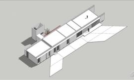
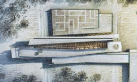
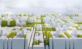
Sketchup Model/Sketchup模型
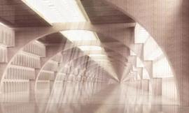
Kerkythea Base Rendering/Kerkythea基础渲染
1. 从SketchUp到 Kerkythea:我把主要时间用在了扩建的设计上,这就导致周边环境看上去光秃秃的。我决定不再花时间建模来表现周边建筑物和景观细节,而是在 Photoshop 中多花点时间。所有额外的建模不会出现在其他的渲染图中,因此我可以更快地在 Photoshop 中处理这些元素。
1. SKETCHUP TO KERKYTHEA: I spent most of my time on the design of the addition which left much of the context looking barren. I made the decision to not spend time modeling in more detail into the surrounding buildings and landscape but instead use that time in Photoshop. All that extra modeling would not show up in any other illustration views and I could Photoshop these elements in much faster.
2. 背景树和近景树:景观可能会让图效果很好,也可能会毁掉一张图。我先在Photoshop中处理远处的树,然后处理近景的树。我从一些图片里扣树图使得树的颜色很多,这样避免了树的过多重复。
2. BACKGROUND AND FOREGROUND TREES: The landscaping was going to make or break this illustration. I Photoshopped in the trees starting in the distance and working my way towards the camera. I used several images to cut from so that I would have a good amount of diversity in color and avoid too much repetition.
3. 地被植物:要找到这个角度的草地图是相当困难的。我尝试在草地中加入尽可能多的颜色,因为我想要暖色调,不想让草看上去过绿。我以前制作了一个视频教程,它展示了我添加草的步骤,请看这里。
3. GROUND COVER: It is surprisingly difficult to find grass images at this angle. I tried to bleed as much color into the grass as I could because I was going for warm tones and didn’t want to see too much green. I created a video tutorial a while ago showing the steps I use to add grass seen HERE.
4. 道路纹理:我还没有改变过的表面就剩下道路了。你不会想到,给道路做一点改变,出来的效果会完全不同。我也是几年后才发现一点细节的改变会让图改变一个层级,变化如此之大。所以我多花了10分钟在表面很快地叠加了一个纹理。我也在地上加了一些落叶,这样就有了秋天的感觉。
4. ROAD TEXTURE: The only surface I haven’t touched yet was the road. It’s one of those subtle moves that you don’t think will make a big difference. However, I have realized over the years that these are the details that bump illustrations to the next level. So spend an extra ten minutes and add a quick overlay onto the surface. I also added a few leaves on the ground to get that autumn feel.
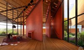
5. 建筑物光和影:周边有了很多景物,建筑就需要被突显出来。因此我调整了色阶,并使用了加深工具给建筑来了一个更强的对比效果。我也增强了室内光线的强度。这个步骤和我以前在这篇博文中的步骤类似。
5. BUILDING LIGHT AND SHADOW: With much of the landscape in, the buildings needed to be punched up. I adjusted the levels and used the burn tool to give more contrast to the architecture. I also increased the intensity of the interior lights. This process is similar to one I used in THIS POST.
6. 雾和深度的体现:这一步渲染图会有大的变化。建筑渲染中最常用的一种调整手段貌似就是对雾的调整。我甚至在室内渲染图中也使用到它。在这个图中,我真想在背景树和近景树之间表现一个空间深度。虽然只用30秒就完成了这一步,但是却完全改变了景观的色调。在这个博文中我对添加雾有更详细的描述。
6. DEPTH VIA FOG: Now come the big moves. Fog seems to be the most under utilized adjustment in arch illustrations. I even use it in interior illustrations. In this case, I really wanted to play up the depth between the background and foreground trees. It’s a 30 second process but completely changes the mood of the scene. I give a more detailed description of adding in fog in THIS POST.
7. 颜色叠加:尽管雾的效果很好,但是它同时也除掉了图像的颜色。为了修正这一点并让图片整体色调统一,我使用了颜色叠加。因为这是一张秋天的渲染图,我大胆地使用了红色和橙色。关于颜色叠加的教程可以在这里找到。
7. COLOR OVERLAY: While the fog is dramatic, it is also washing out the image. To fix this and bring all of the colors of the image into a similar range, I applied a color overlay. Since this is an autumn rendering, I went with bold reds and oranges. A tutorial on color overlays can be found HERE.
8. 景观颜色更加多样:草地的色调看上去太单一了,我希望让它更复杂,颜色更多样。我再一次使用了网格纹理,这张纹理是我在这个项目的其他图中也使用过。我根据渲染图调整了纹理的透视,然后把它叠加在草地的上面。接着我添加了一点高斯模糊,这样就达到我想要的效果。
8. MORE LANDSCAPE COLOR DIVERSITY: The grass was looking a little too even in tone and I wanted to take on more complexity and color. I took the same grid texture that I have been using in the other illustrations for this project, adjusted the perspective to match the illustration, and overlayed it on top of the grass. I then applied a slight guassian blur which gave me the look I was going for.
The Final Illustration/最终渲染图
9. 细节和颜色调整:我比较喜欢高对比度和颜色饱和的图像,所以我使用了 Photoshop 插件 TOPAZ LAB ADJUST 来增加图片的细节和调色。然后我把图像复制了一层,将复制图层的混合模式改为“叠加”,以此来增加一点对比,这些在THIS TUTORIAL可以看到。
9. DETAIL AND COLOR ADJUSTMENT: I tend to favor images with higher contrast and color saturation, so I jumped into the Photoshop plugin TOPAZ LAB ADJUST to increase the detail of the image and tweak the colors. I also duplicated the image and set the layer blend mode to “Overlay” for a little bit more contrast as shown in THIS TUTORIAL.
出处:本文译自visualizingarchitecture.com/,转载请注明出处。
|
|
专于设计,筑就未来
无论您身在何方;无论您作品规模大小;无论您是否已在设计等相关领域小有名气;无论您是否已成功求学、步入职业设计师队伍;只要你有想法、有创意、有能力,专筑网都愿为您提供一个展示自己的舞台
投稿邮箱:submit@iarch.cn 如何向专筑投稿?